O-KAM Pro
A localization redesign for a Chinese security camera company serving 300,000+ customers in the U.S.
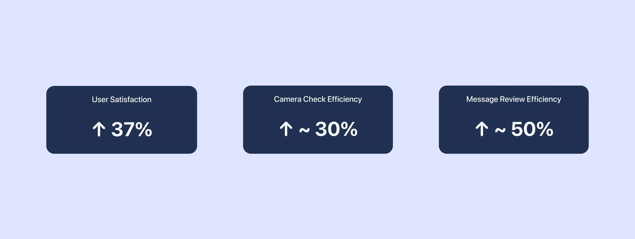
Usability testing showed a 37% increase in user satisfaction and 50% improvement in message review efficiency.
· Localization UX · Cross-Cultural Design · Smart Home Experience ·

Role
UI/UX Designer
Timeline
3 months
December 2023 - March 2024
Team
1 Product Manager
1 Designer
2 Developers
Skills
Competitor Analysis, Questionaires, User Interview, Wireframing, Prototyping, Usability Test
Overview
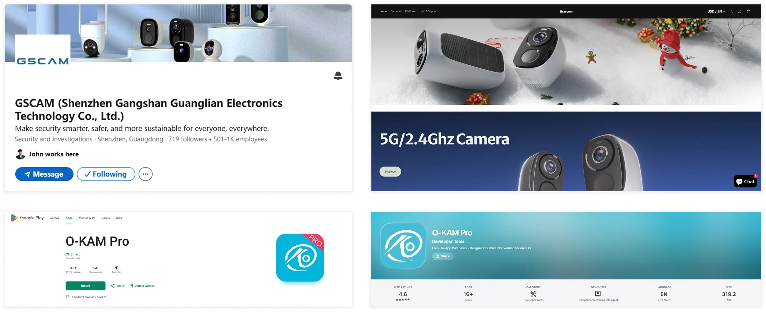
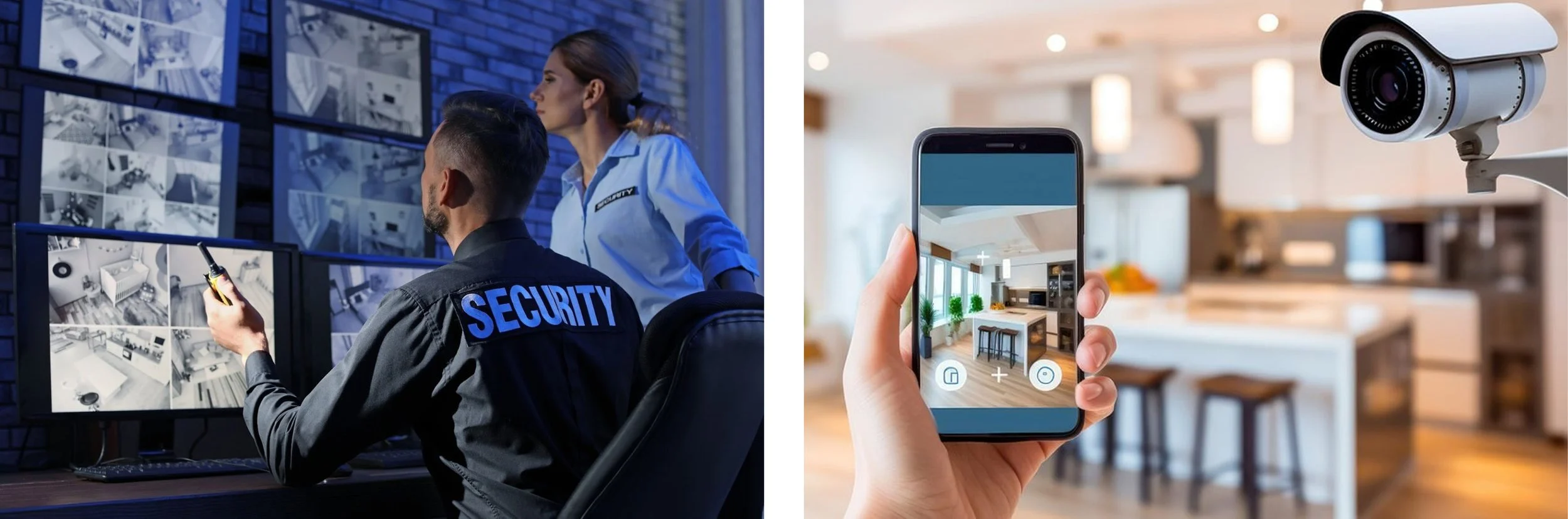
GSCAM, located in Shenzhen, China, is a smart security company expanding into the North American market. Its camera ecosystem relies on the O-KAM Pro mobile app for monitoring, alerts, and device management.
However, the original experience was primarily designed for the Chinese market, creating usability challenges for U.S. users with different expectations around information hierarchy and interaction patterns.
Over a 3-month collaboration, our team redesigned the app experience with a focus on cross-cultural UX research and UI localization.
The Problem
1️⃣ Dense information and weak hierarchy caused cognitive overload for U.S. customers.
2️⃣ Emotional user needs beyond monitoring were underrepresented.
Featured Solutions
↓ Full Case Study
01 Context
Unlike professional security systems that require a monitoring service, self-monitoring cameras allow users to monitor their own spaces through connected apps.
In the U.S., they are commonly used in homes and small businesses for real-time alerts, motion detection and remote control. Users receive notifications directly on their smartphones, check live feeds, store footage in the cloud without third-party involvement.
Professional CCTV monitoring & Self-monitoring
Current App & Flow
By the end of 2027, 18 million homes in the United States will have self-monitoring security systems, which is a positively growing market.
However, the mobile app’s usability poses a challenge for Chinese companies seeking for more U.S. customers.
02 Research
Questionnaire + Phone Interviews
The current app doesn’t perform well for U.S. customers’ emotional needs due to the poor usability.
To better understand our customers, we designed the questionnaire together and sent them to 100+ U.S. customers through a link in text messages. The phone numbers were provided by the customer service manager from GSCAM.
100+ responses were collected after one week,
8 agreed to have a phone interview for further inquiries. After analyzing the replies, we listed some important data as below:
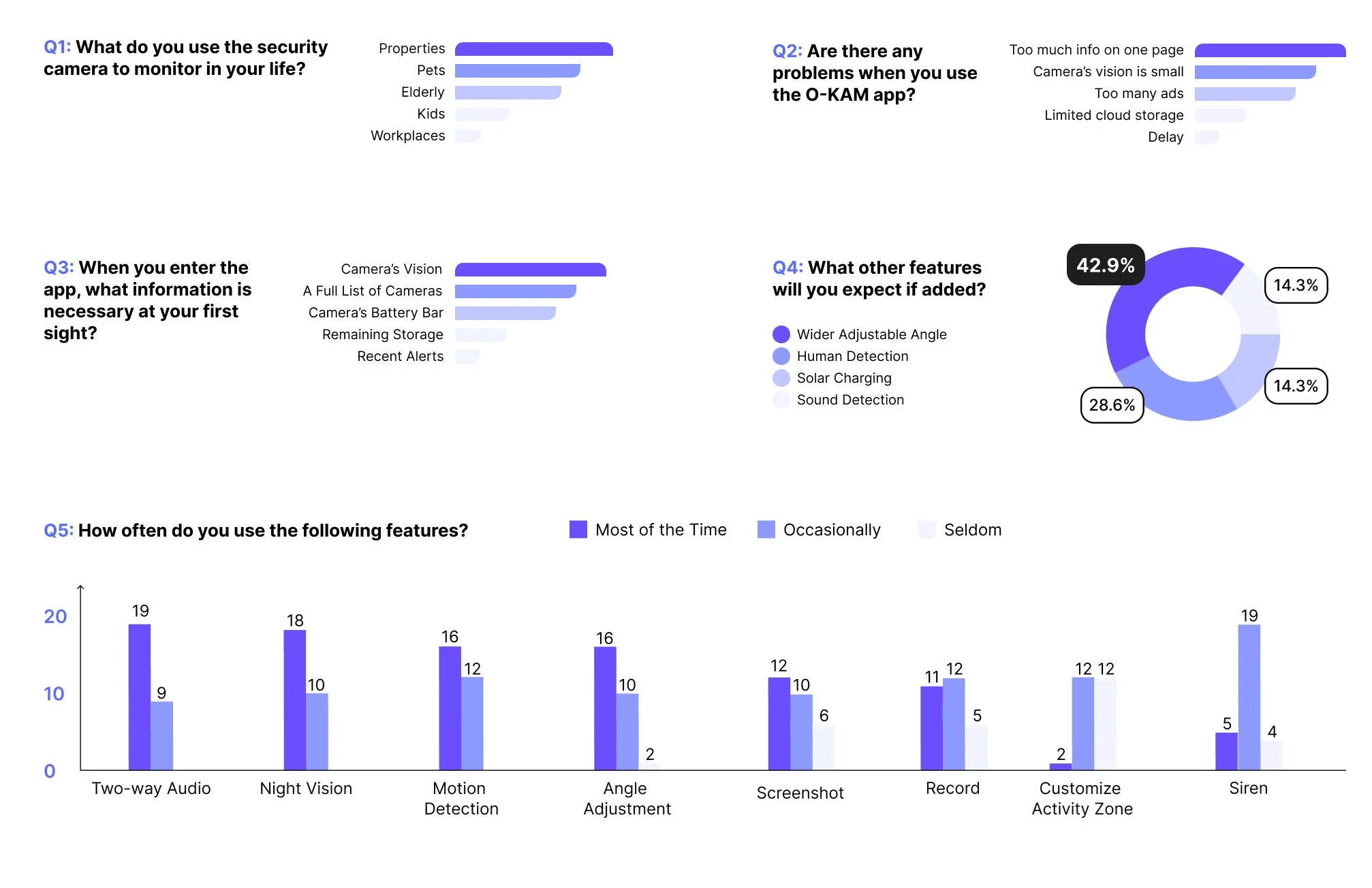
We learned that:
Most customers monitor not only their properties, but also their kids, pets and the elderly through our products, there are emotional needs beyond monitoring;
U.S. customers feel the current app is confusing with too many entries on each page. They spend more time navigating what they need;
U.S. customers would prioritize their cameras’ vision and related info upon launch, and the most expected feature is the wider angle adjustment.
Cross-Cultural Research
Direct translation from the original Chinese version causes information overload for U.S. users.
Realizing that we are designing for U.S. customers and we all grow up in the Chinese social environment, I proposed to do a cross-cultural research on app design between China and U.S.
I mainly referred to the article: “Why are Western apps more minimalistic than Asian apps?“ by Bas Wallet, posted on Medium on Nov 12, 2023, one month before our project.
And summarized key findings in a comparative way :
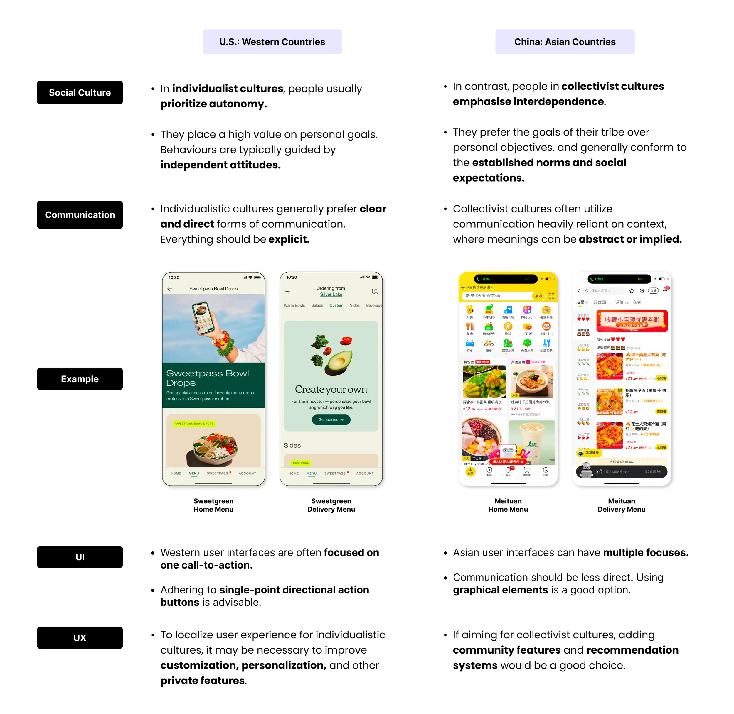
Competitor Analysis
Keeping the cultural difference in mind, we continued analyzing the app platforms of the competitor products, through Apple Store, Google Play and other online app stores :
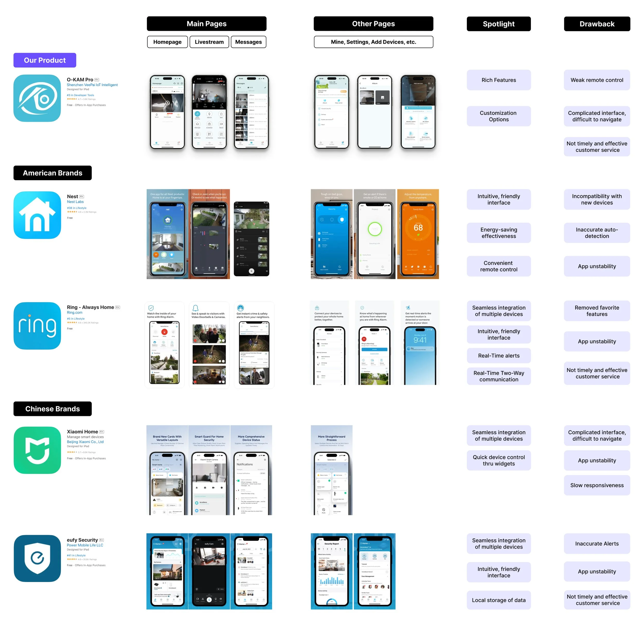
We concluded that in the camera app, U.S. customers prefer :
Simplified information structure: help easily navigate and make an intuitive user flow;
Clear visual hierarchy : has better usability with one focus section on each page;
Real-time features : like two-way communication and customizable buttons for remote control are necessary;
but dislike :
interfaces with a fair proportion of each section, too many entries and no focus.
These findings reinforced our cross-cultural research insights.
03 Define
Problem Statement
🧶1. U.S. customers struggle with the intense information and weak visual hierarchy in the Chinese app interface ;
🧶2. U.S. customers’ emotional needs beyond security monitoring are underrepresented in the experience design.
Design Strategies
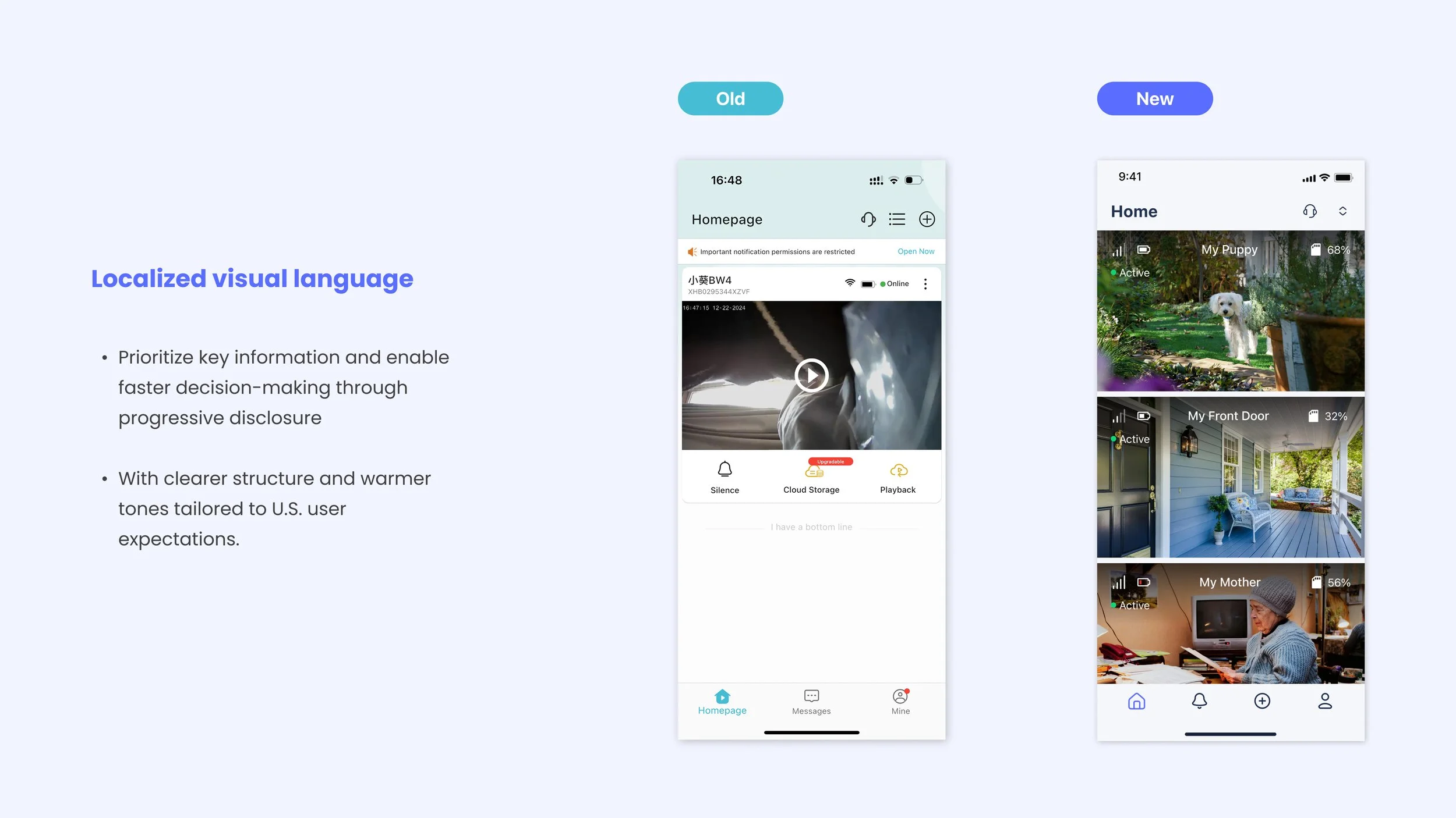
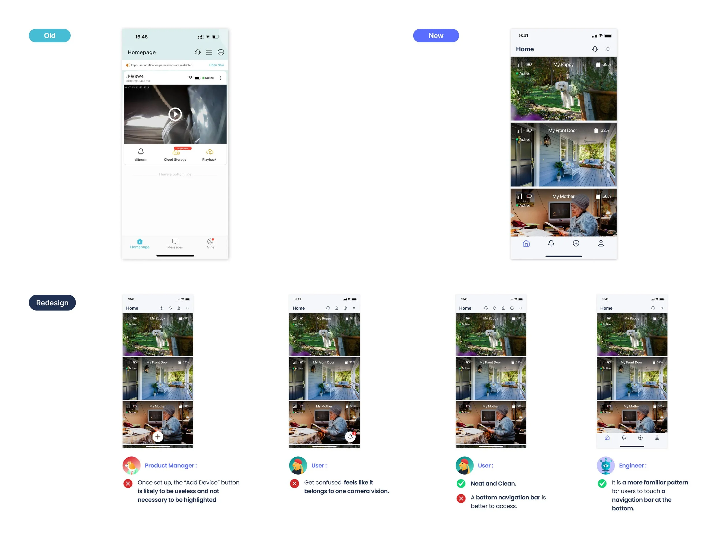
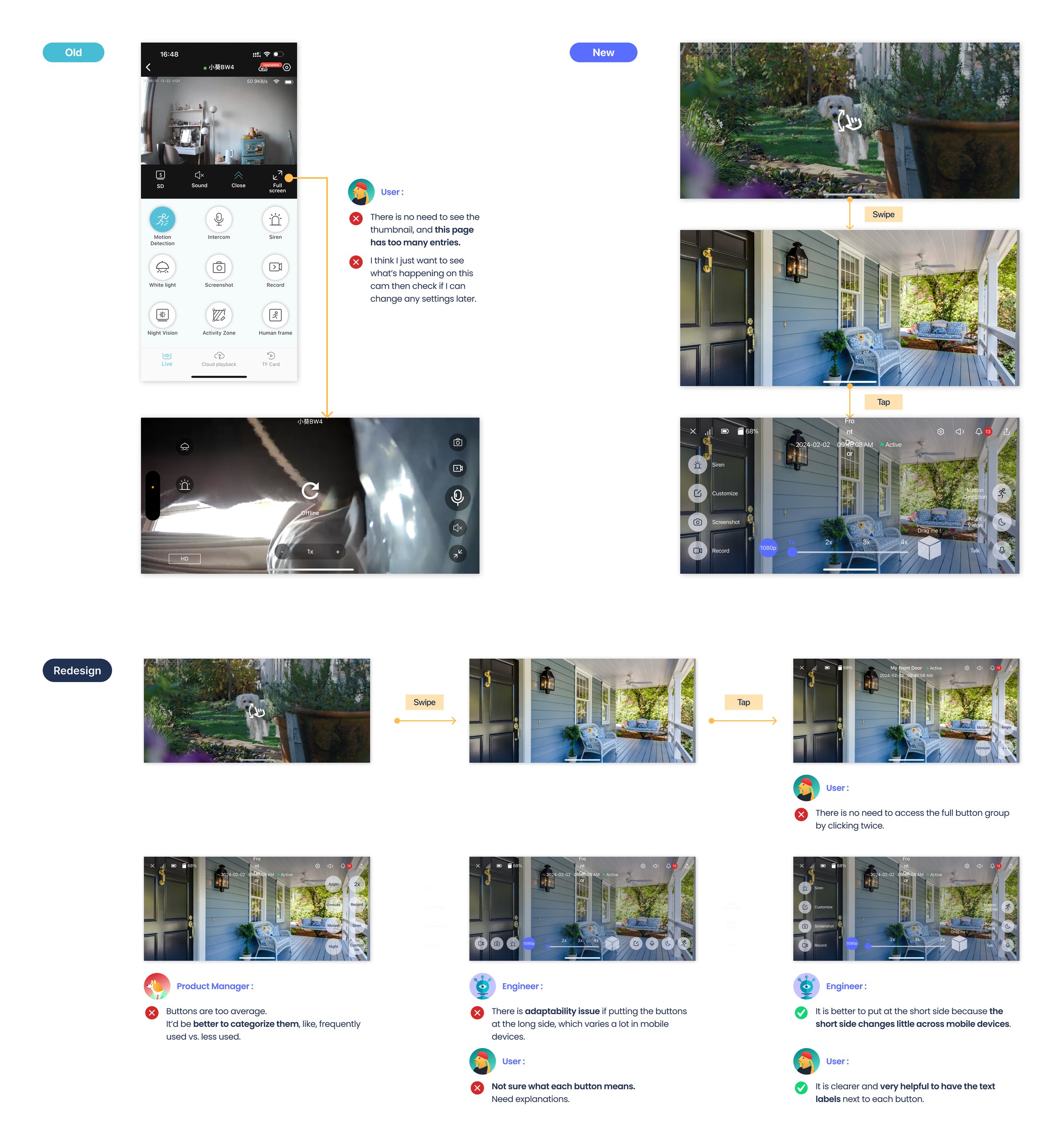
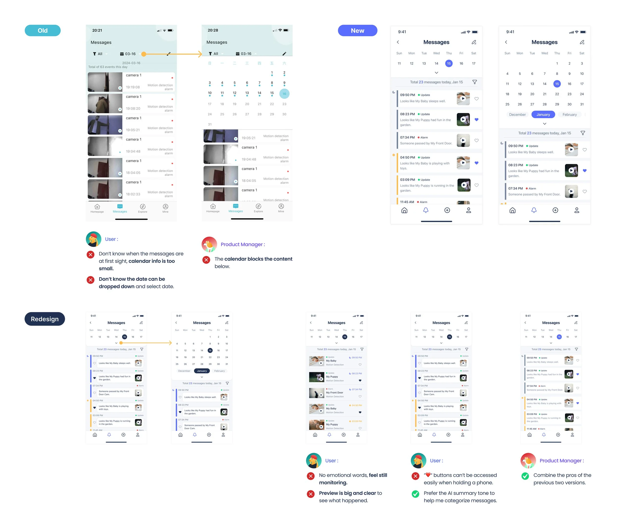
🚀 1. Make U.S. customers master the app intuitively through redesigning the app’s visual hierarchy, especially the frequently used interfaces: Homepage, Livestream and Messages;
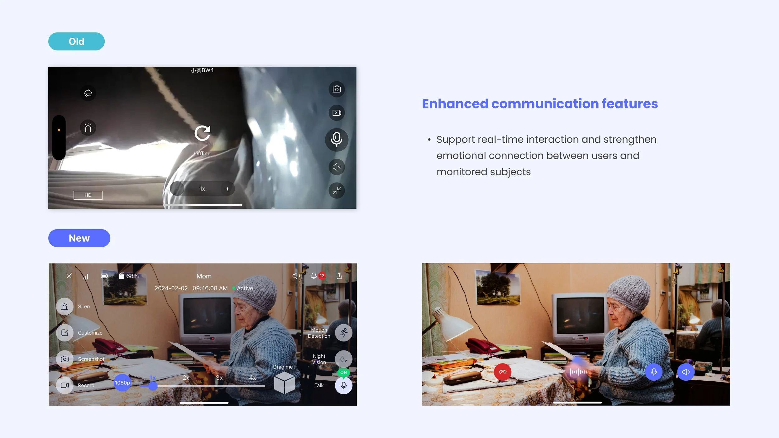
🚀 2. Improve U.S. customers’ stickiness with our product through highlighting interactive features to make it a medium for emotional connections.
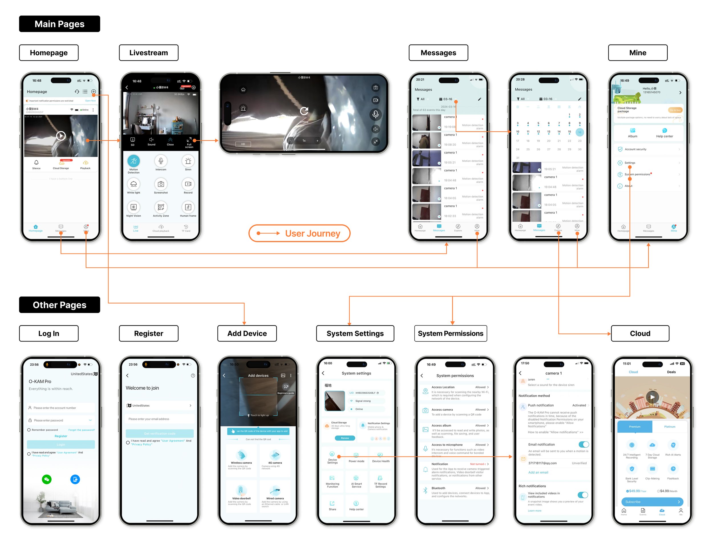
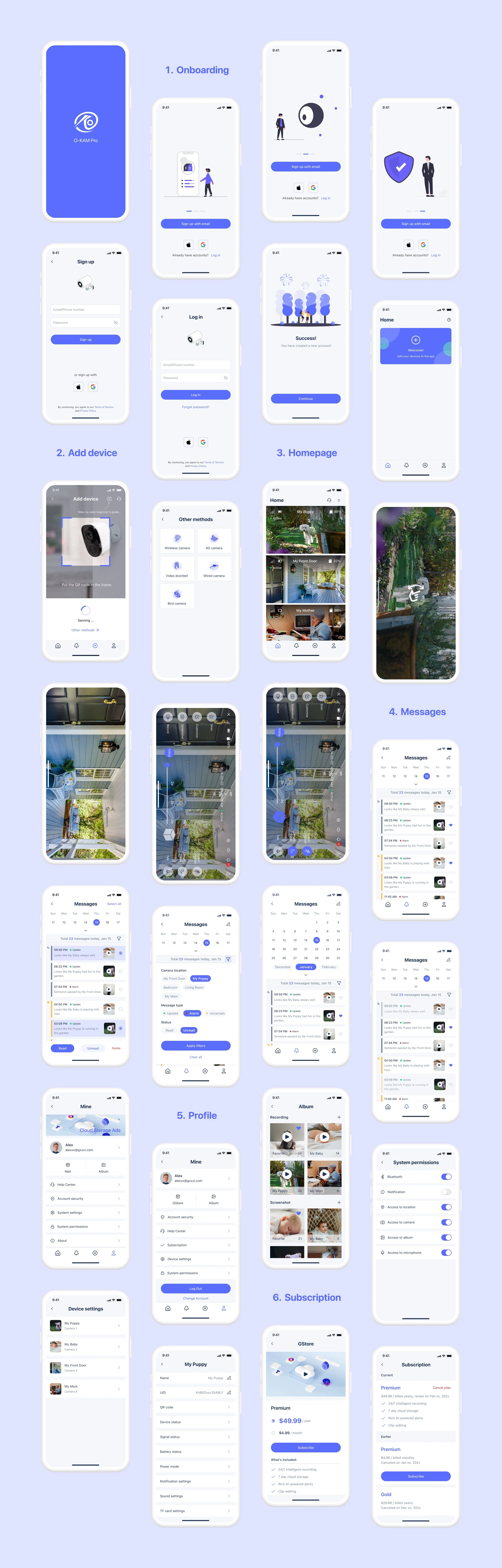
04 Design & Iteration
Here I show the process of redesigning the most frequently used “Main Pages“ - Homepage, Livestream and Messages.
The rest pages followed the same design strategies.
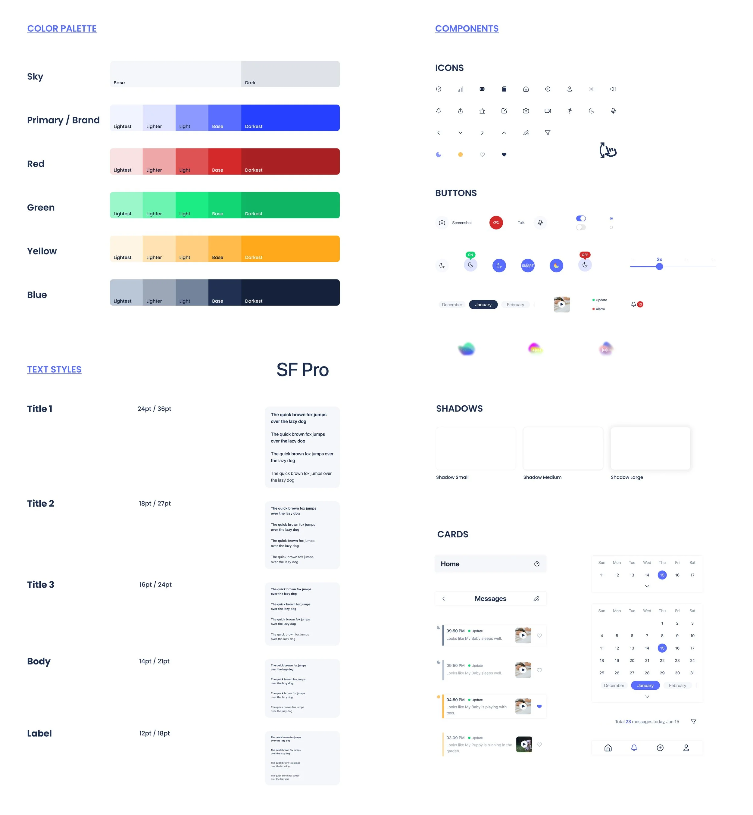
💡 1. Color Change
Add red for warmth.
Reduce the cold machine vibe from the original brand color & camera itself.
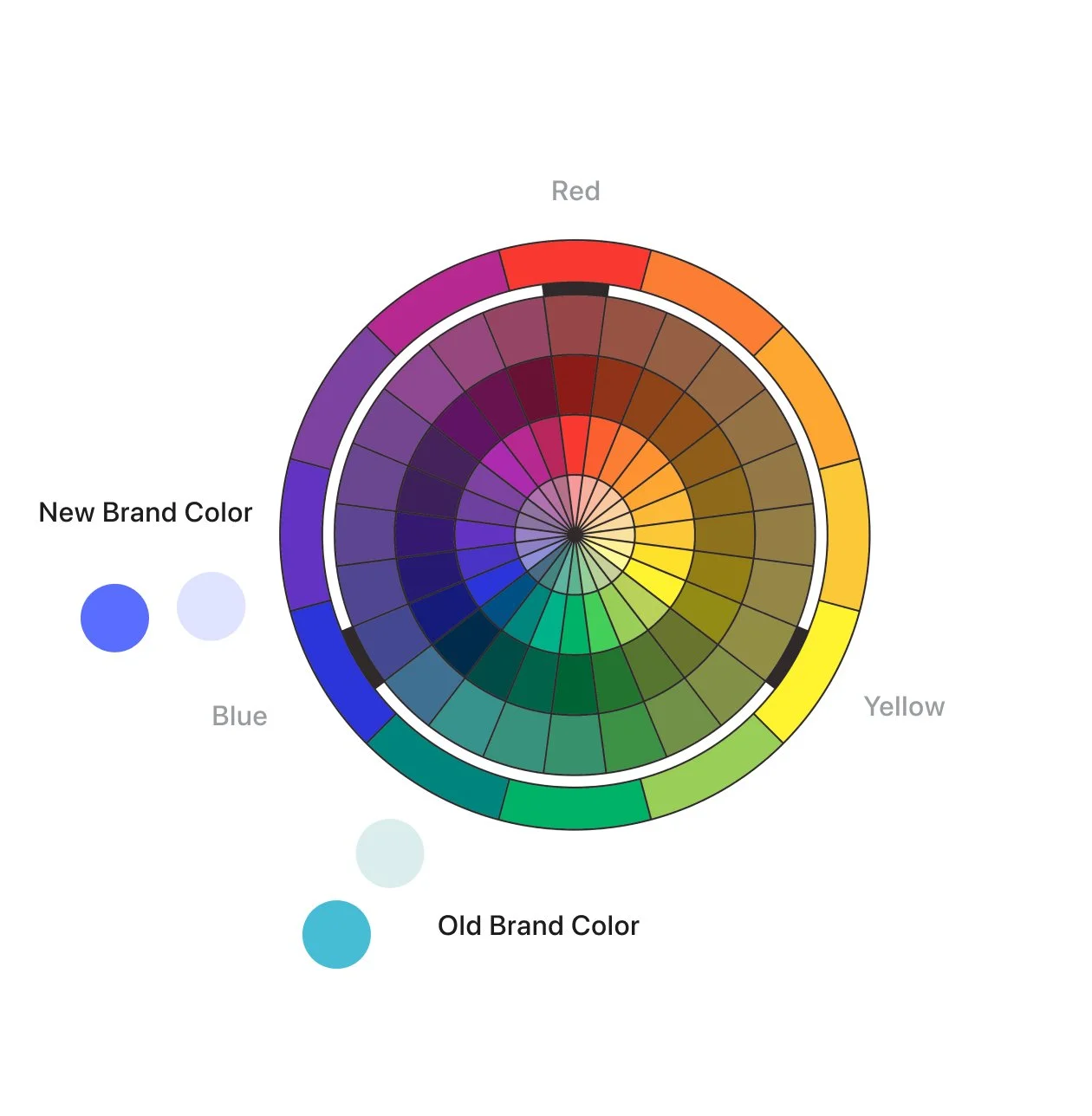
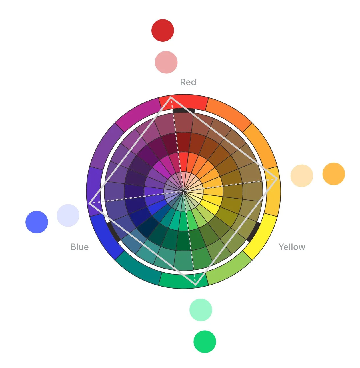
New Color System: Square Color Harmony
💡 2. Redesign Visual Hierarchy
Reorganize the proportion of all sections.
Make one focus on each page + weaken others.
Less entries and lines for visual simplicity.
In the following 5 weeks, our design team weekly met with PM and engineers to compare design drafts and combined insights from 2 usability tests.
a. Homepage
b. Livestream
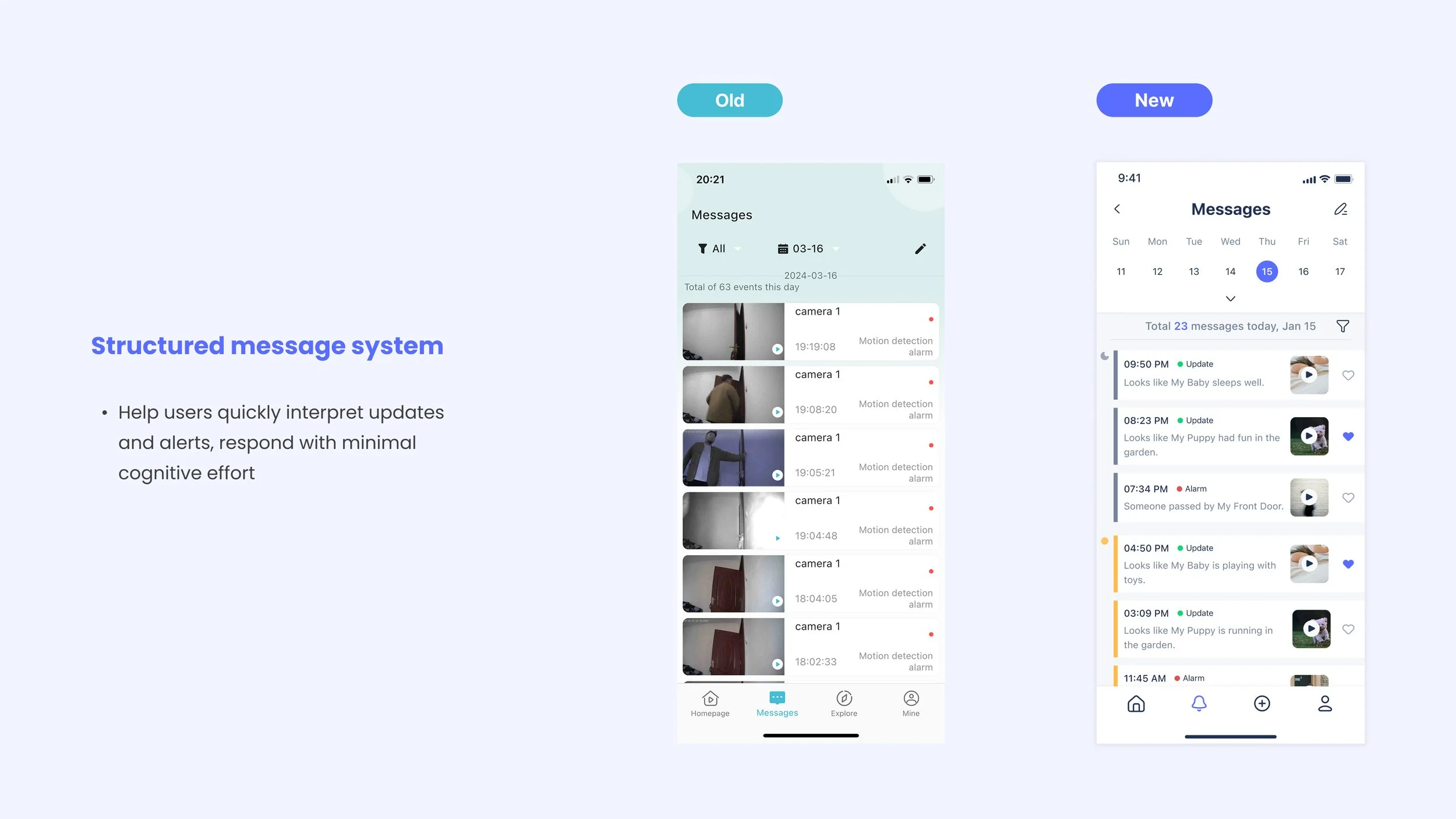
c. Messages
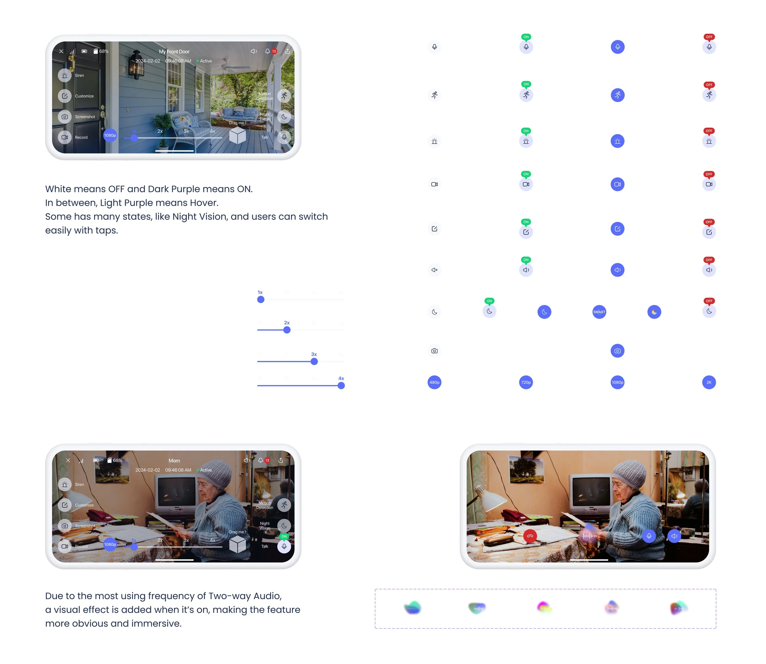
💡 3. Redesign Components
Customizable buttons with evident state changes.
Emphasize communication and interactive mode.
05 Style Guide
06 Delivery
We applied the redesign strategies and style guide to other pages: Onboarding, Add device, Mine, Subscription and System settings, to keep the visual consistency.
Impact
07 Reflection
Compared to Chinese users, U.S. users tend to prefer clearer information hierarchy, and progressive disclosure. This required us to simplify the decision points and ensuring each screen focuses on a single primary action.
By aligning the experience with these expectations, the design not only improves usability but also reduces friction in key flows, supporting better feature adoption and long-term user retention.
08 Next Steps
👉 As AI detection evolves, the next step can be to expand message types and enable more personalized tone in AI summary, helping users easily understand messages and increasing feature usage.
👉 In the future, the app can introduce AI-powered photo recap features that automatically generate themed highlights, encouraging users to revisit content and strengthening long-term engagement and retention.